Aaron Gunderson
You’ve heard of parking minimums, let me introduce you to bike parking minimums. Same thing but for bikes.
Grafana is just needlessly confusing some times.. the UX for saving dashboards, setting the default dashboard and configuring a dashboard is just confusing.
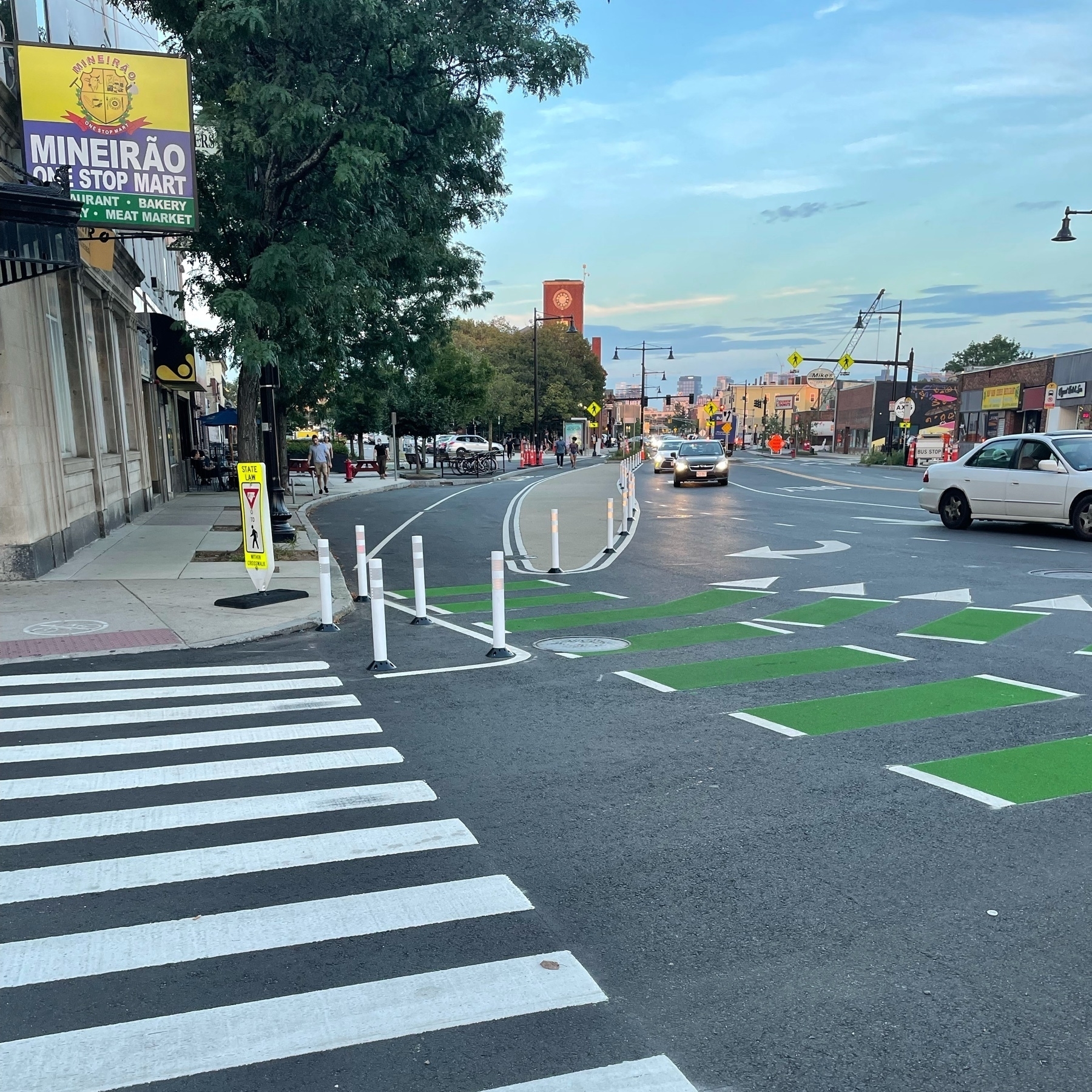
Got honked at for giving a thumbs down and pointing to the no turn on red sign as I walked through the pedestrian light on my corner. Come on people you can wait 20 seconds.
A vegetable farmer was in debt and came up with a fake death scam.
They told their partner it would be a great daikon.
How small do you make your incremental changes when requesting review? How do you balance atomic rewrites vs smaller steps along the way. Primarily thinking code but open to other scenarios.
Cars are asocial and a cancer on societies social fabric, changing how we see others from humans into obstacles.

